What judges say:
|
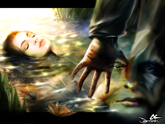
"This one rules. Very good picture, excellent use of autumnly colors. A bit blurry in some parts, but that's all for the minus side.",
"Styles blend very well together. Although the hand is a bit weak in overall execution, the message it conveys is clearly understood. Colors blend nicely.",
"I don't think the face needs to be there at all. The very prominent placing of the hand calls attention to some rendering problems with it (like the blacks being too deep, it gives a dodge/burn feeling although it's not very distracting overall)"
|
|
