Gathering'97 GFX review
by 3D Addict-
At this years Gathering, the gfx compo was set to a limit of 20 pics.Which means that all entries have been examined by a jury, so only 20 best pics have been selected to be shown for the audience.The idea of 20 pics only, seemed to me pretty odd, for such a big party as the Gathering is.However, I'm sure that organisers intentions were to eliminate all the low quality entries in order to make the compo less time consuming.Still 20 images seemed to me rather too low.Anyway, here is a short review about all the images which are worth mentioning.I tried to be as objective as possible in my judgment, by covering both the positive and negative aspects of every image mentioned here.
First place
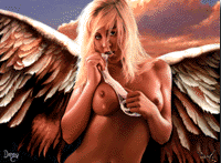
First place went to Danny & Louie for their image called "Angelic Particles".The image consist of one motive and a background.The motive is a nude girl with wings attached to its back.Although the Angel takes up nearly all the space, the background is visible in the upper part of the image, which is sky.
The first visual impression one gets, is the usual "just another babe pic".However after a closer look, one must admit that this is not the case with "Angelic Particles".The main reason for that, is the EXTREMELY high quality of the image.Firstofall, thanks to the right color palette, the image looks very realistic.The angels skintone, hair color and wings color fit very well together.Secondly, the overall body proportions, seems to be perfect too.Furthermore, there is no doubt that both Danny and Louie master the antialiasing technique to perfection, as no visible aliasing is present.The details, which are especially worth mentioning for the extraordinary high level of drawing quality, are, hair(especially just above Angels forehead), wings(done by Louie), and hands(which are nearly perfect).
However, there are few subtel (but still very important) aspects of the image which could have been done better.Firstoffall, Angels left eye pupil(right for the viewer) seems to be way too dark, and makes the upper part of the face a bit out of proportion.Secondly, both forearms and elbows lack proper shading and a bit detail (especially Angels right forearm and elbow).
Second place
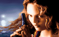
Second place went to a Norwegian graphician TMK.The image is called "Sweet and Sour", and was drawn using DP2e.The main motive of the picture, is a girls face in the foreground with a gun in her hands.The background consist of a white lightsource hanging over the sea.
Both the female face and fingers, are actually very well drawn, without any disproportions.However the image seems to be too blurred.Furthermore, it seems as if some areas of the face haven't been finished.The reflections of the lightsource on the sea are very convincing, but the sea just above the lower image border is much less natural.Anyway, TMK is clearly improving, as this must be one of his best images so far.
Third place
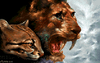
"Katka" is the name of the image, and was drawn by Saffron.The first impression one gets is the similarity to Mades, "AnimalReign".The image is composed of two cat spicies heads.Both heads are placed on the left, with the lions head being on top of the other cat's head.The background is only visible on the right side as a white texture. Both heads are well drawn, but I believe that the lions head was done in a hurry.The smaller head is indeed VERY WELL drawn.Especially the eyes, which make the cat's facial expression very tense, yet very natural.Saffron have clearly chosen the right color palette in order to achieve the natural look.Unfortunately, the lions head(the big head), seems to lack the same amount of detail and the tens facial expression of the smaller cat.It's a pity, that Saffron haven't managed to draw the image completely.
Fourth place
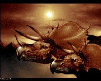
Fourth place went to Typhoon with his image "Triceratops".As in Saffron's "Katka", here too, we have two heads as the main motives.They are not cats heads though, but dinosaurs.The background is represented by a sun, clouds and a bit of a landscape.The dinosaurs are VERY WELL drawn and do really look like dinosaurs.Both heads are very detailed and well antialiased.Typhoon have used very few color ranges, which makes the image very atmospheric.I believe that there is a minor, but as always very important, detail which makes both dinosaurs look as if they were standing in a museum rather then being alive and surrounded by ancient nature.It's the light reflections in dinosaurs eyes.The reflections seems too intense, as if their eyes were glass balls.Anyway, I really like this image, and look forward to see Typhoons future releases.
19th place
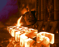
The image "Steel" by Jerry, placed incredibly low, even though the overall quality of "Steel", outperforms most entries by far.The only real drawback here, is the fact that the image is more of a logo pic then a compo pic.Still, 19th place seems way to low.Anyway, the idea behind the image is very original.The image consist of a huge Rebels logo being created out of fluid steel at an ironworks factory.The background, is the inside of the factory together with two factory workers.Like in "Triceratops" by Typhoon, Jerry too used very few color ranges and succeeded in making a very atmospheric image.Both shading, antialiasing and texturing are well done.I like this image a lot.
Other images which are worth mentioning:
7th place:
"tjo bing" by Sunday, is certainly very original and interesting piece of work.At first, I was convinced that the image was a simple scan, but after talking with the author, I got to know that the image was completely drawn by the author himself.
13th place:
"The Dreaming" by Pix, is a very well pixelled image, although it lacs the overall composition.This image should place much higher though.
15th place:
"Philterfrog" by Phelix, is well drawn, but a bit too blurred.The image consist of many motives, but with no relation to eachother whatsoever.Looks more like a commercial advertising image.
6th place:
"saaolla" by Mike.Most probably an unfinished image, as the antialiasing is not finished, and many areas needs polishing.
check out the Gathering Gallery for more pics
| news galleries articles database links |